Designing Penguin...
"When Penguin was founded in 1935 with the radical concept of producing inexpensive paperback editions of high quality books, it adopted an equally progressive approach to typography and cover design. Under Jan Tschichold in the 1940s and Germano Facetti in the 1960s, Penguin became an exemplar of book design.
Returning to London from a weekend at the Devon home of the crime writer Agatha Christie in 1934, the publisher Allen Lane scoured Exeter Station for something to read. All he could find were reprints of 19th century novels and Lane decided to found a publishing house to produce good quality paperbacks sold at sixpence each, the same price as a packet of cigarettes.
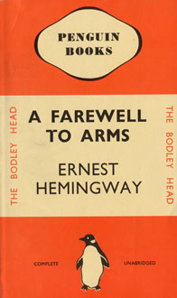
Lane’s secretary suggested Penguin as a “dignified, but flippant” name for the company and the office junior Edward Young was sent to sketch the penguins at London Zoo as its logotype. Young was then asked to design the covers of the first set of ten paperbacks to be published in summer 1935 including Ariel and A Farewell to Arms. Considering illustrated book covers to be trashy, Lane insisted on his following a simple horizontal grid for Penguin’s jackets in colours that signified the genre of each book: orange for fiction, green for crime, and blue for biography.
The rigorous application of colour, grid and typography in those early paperbacks instilled Penguin with a commitment to design from the start. The company then strengthened its design ethos under the direction of the German typographer Jan Tschichold (1902-1974) during the 1940s and the Italian art director Germano Facetti (1926-) in the 1960s."
(Image/article taken from British Design Museum website. Rest of article here.)
posted by PABLO GAZPACHOT at 1:13 PM
![]()
![]()

0 Comments:
Post a Comment
<< Home